


At the beginning of the year, we spoke about the rise of personalised commercial design and it’s a concept we’re only seeing become even more prolific. As businesses continue to move away from the traditional, corporate office design that typifies generations passed, workspaces are becoming increasingly diverse, unique and determined by individual tastes and brand identities.
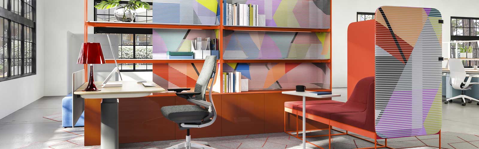
A motif which is no doubt a direct result of this newfound creative freedom is a more liberal use of colour. Business owners and designers are starting to have more fun with colour in commercial spaces, waving goodbye to the blue-grey colour palettes that dictated the classic corporate office.
Fun, freedom and experimentation with colour is something we would never want to curtail – especially when it comes to expressing your brand identity and company culture through design. That said, we do want to express how important it is that any colour scheme is decided after a strategic and thorough decision process.
Clashing colours might be one of the major interior design trends for 2020 but that doesn’t mean use of colour doesn’t need to be as strategic as fabrics, finishes, furniture and space layout.
The psychology of colour
Colour psychology explores the relationship between specific colours and the mental state, behaviours and moods they invoke. Theories behind colour psychology apply across the board but are particularly important in the working environment where wellbeing and productivity are so crucial.
Design agency, Aquent did some investigation around the topic and came up with results which proved how closely connected mood and efficiency are to colour. They took a period of six weeks and each week, painted the workspace a different colour: red, blue, yellow, grey, green and black.
To gather data from the psychological experiment, the study required staff to fill out a questionnaire at the end of each week. The results demonstrated that:
- Grey was extremely demotivating
- Red proved to be one of the most motivating
- Green and yellow were the best colours for home-style (resimercial) environments
Colour Psychologist, Dr David Lewis carried out a body of research in collaboration with Canon and found that 80% of 1,000 UK office workers believes that the colours of their surroundings have a significant effect on both performance and emotion.
The research also revealed that:
- Blue was the all-round winner for enhancing mood and brain function
- Red tended to cause the most mental agitation and feelings of tension
Lewis also discovered that when surrounded by their favourite colour, subjects were found to be 10% more productive. Of course, it’s impossible to cater for every person’s favourite colour but it is paramount to do your research first if you want to foster an environment which is going to be as comfortable, inspiring and inclusive as possible.
On that note, here’s some advice to point you in the right direction…
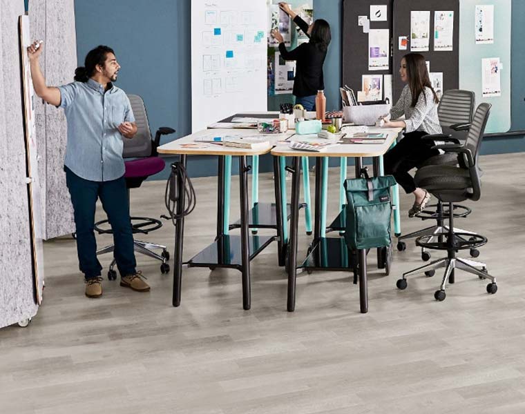
The best colours for collaboration and co-working spaces:
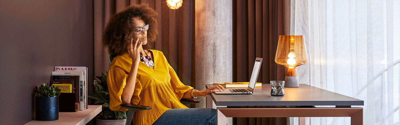
Orange for its uplifting qualities and ability to energise in an area which is designed for teamwork, idea sharing and high-energy communication. Yellow is also known to inspire energy but can also create feelings of mental strain in others – consider using gold accent features as a compromise. Brown is also a good colour to use in this type of setting as it evokes feelings of trust and comfort, meaning introverts are more likely to feel less anxious about contributing.
The best colours for meeting and conference rooms:
This type of setting can often mean you’re sitting in it for a prolonged period of time so include some orange which is thought to improve oxygen flow to the brain. Blue is also the ideal shade in meeting rooms as it inspires intellectual thought but, in a calm, collected way – as opposed to the high energy of collaboration and breakout spaces. A combination of blue and green is believed to help in decision-making processes too.
The best colours for rejuvenation settings:
Rejuvenation spaces and social settings are designed with relaxation and a break away from work so the colours you choose need to foster this kind of atmosphere. Go for light greens which calms and soothes tired eyes. Go for browns, neutrals and wood to create a home-from-home feel and introduce elements of biophilia and nature. You could also consider light purples like lilac and lavender which are thought to dampen the creative process and relax to help you switch off effectively.
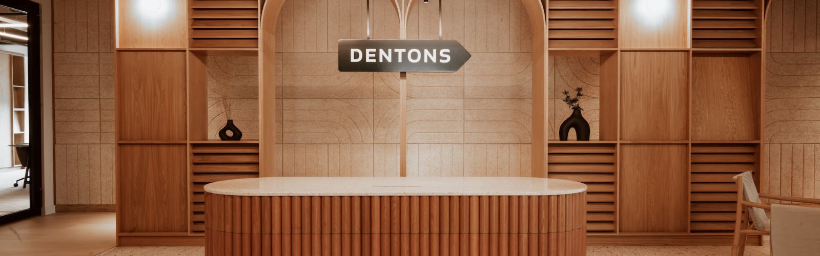
The best colours for office receptions and welcome areas:
We’ve got a whole plethora of advice on how to create a welcome space which creates the right first impression but colour is undoubtedly a key part of the process. It can be tempting to want to splash this space with your brand colours but it pays to be a little more subtle with this approach. That said, you do want the space to communicate your identity so selecting colours for a reception is an extremely personal decision. We would just recommend staying away from red, black and any harsh colour combinations.
Some other tips:
Once you’ve picked out your colours, it’s then worth taking some time to think about how you’re going to arrange them together. Here are some general rules of thumb that we would always recommend sticking by:
- Although red has its place, it does tend to be a contentious colour so just use it sparingly. Use it as an accent shade (e.g. cushions or screen dividers) rather than a large block wall.
- Let in as much natural light as possible – although tungsten light might appear white, it actually contains a large amount of red light which can cause strain on the eyes and brain.
- Use harmonious schemes in areas designed for relaxation or concentration so that the brain isn’t distracted by focusing on contrasting colours.
- Don’t create your whole aesthetic based on one colour trend – you will only end up having to refurb your workspace too regularly.
- Use colours going from light to dark vertically so that it mimics nature otherwise it can cause mental unease or agitation.
- Consider going for an off-white neutral or a very light grey in place of white as white can be extremely high maintenance, especially in busy workplaces.
- Don’t overcrowd colour – balance it out with plenty of light or blank areas else the space can feel cluttered and ‘loud’.