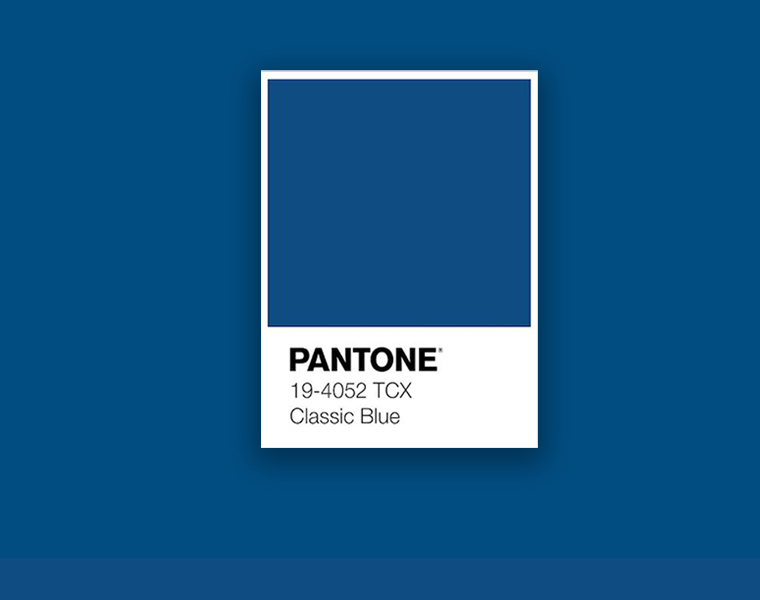
Drum roll please… and the Pantone Color of the Year for 2020 is Classic Blue or for those colour geeks amongst us, 19-4052 Classic Blue. As the name suggests, it’s a classic blue shade which is closer to a navy than a turquoise and a hue we’re expecting to see leaking into office design schemes more and more throughout the year.
In this blog post, we explore the qualities of Classic Blue, the benefits it is predicted to bring to the world of design and development, and then how you can introduce it into your own workspace interior design. So without any further ado…
What is the Pantone Color for 2020?

Classic Blue is the shade of the moment according to the experts at the Pantone Color Institute and it’s a relatively simple colour when compared to some of the Color of the Years we’ve seen in the past. In 2016 we had Rose Quartz – a modern pastel pink, and just last year we had the interesting Living Coral crowned queen of the colour charts.
Blues are cool tones by their very nature but Classic Blue is towards the warmer end of the spectrum. A deep, almost royal blue that is more luxurious than lighthearted; less of a biophilic blue and more of a rich, regal hue.
What are the benefits of Pantone 19-4052 Classic Blue?

Those in the know have given Classic Blue the prestigious accolade this year for a number of reasons, including:
- The calming effects it has, which is essential for good mental wellbeing. Read more about the psychology of colour in office design.
- It’s ability to encourage confidence and better connections between people, which are two great attributes when considering the changing face of teamwork and the era of hyper-collaboration we are living and working in.
- It’s a universally appealing hue – a good design tact to take when considering inclusive workplace design.
- It’s an uncomplicated and timeless colour so will help when it comes to future-proofing your workspace design scheme.
How is Pantone Color of the Year chosen?

As we mentioned above, Pantone Color of the Year is selected by the Pantone Color Institute but it’s not a decision to be taken lightly. The institute spend the year before doing plenty of preliminary research and analysis to ensure the verdict is an educated one.
They use colour trend forecasting, industry insights and patterns of consumer behaviour to make predictions around what is going to be popular. It’s not just the interior design industry by any stretch of the imagination either – the research spans everything from packaging, architecture and entertainment, to fashion, make up and travel destinations.
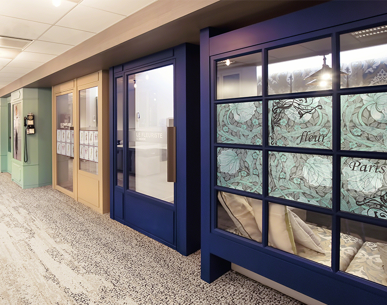
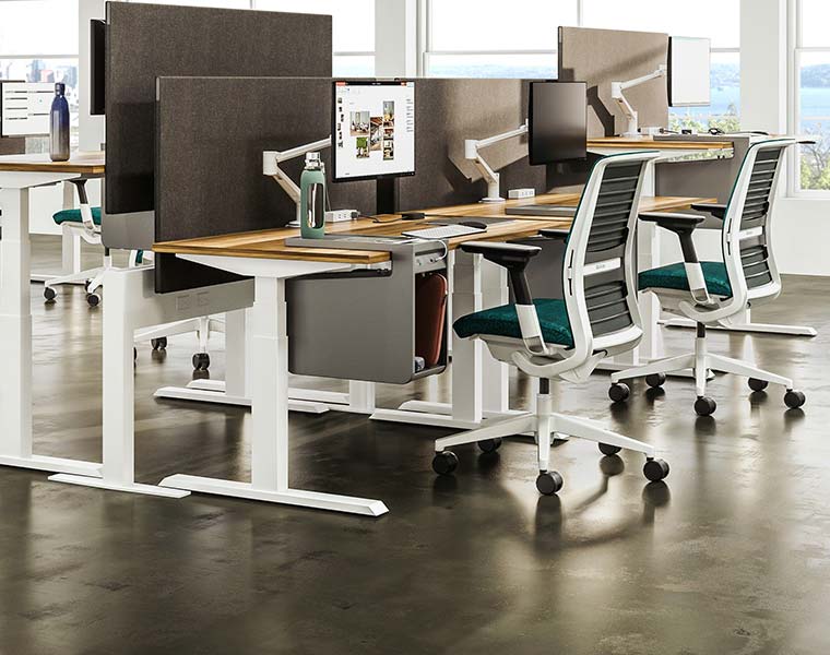
Incorporating Classic Blue into your office design

When it comes to incorporating Pantone’s Color of the Year into your own office interior design, we recommend starting small and building up gradually. Trends can move quickly and you don’t want to end up stuck with something you might not like not too far down the line. Use it to compliment the rest of your design scheme and a way to refresh certain areas within the space.
Ways you can apply a touch of Classic Blue here and there include:
- A painted or wallpapered feature wall
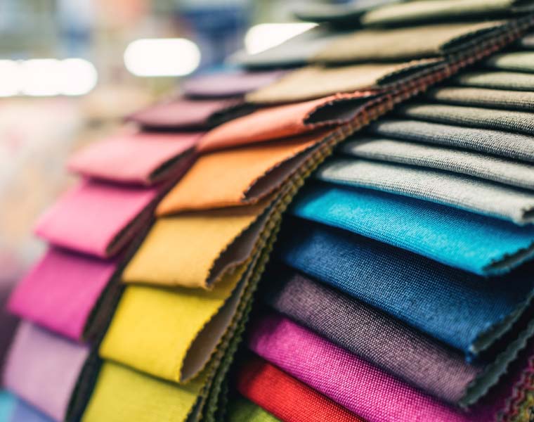
- Feature pieces among your hard or soft furnishings (sofas, arm chairs, breakout chairs, dining chairs)
- Cushions, throws and rugs if you’re embracing resimercial design elements
- Small decor items such as vases, frames, storage trays, plant pots etc


