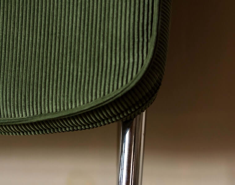
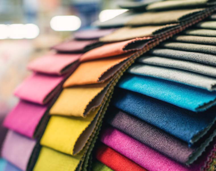
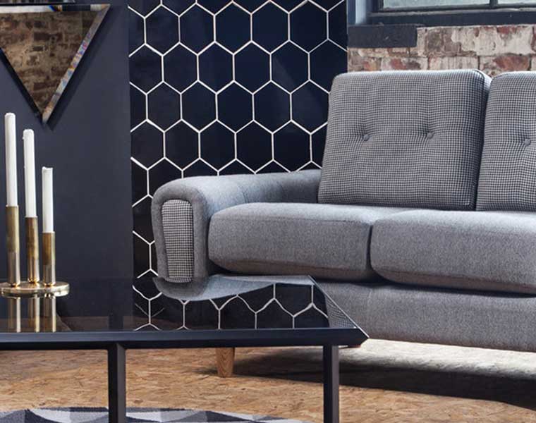
The texture of a space is commonly understood as the parts that you can touch – how a space and the various design elements within it feel physically. Texture isn’t just about the tangible aspects of a design scheme or the tactile elements of the space though, it’s also about visual appearance.
Texture can be seen as well as felt – it’s a multi-sensory experience. You don’t always need to touch a surface or material in order to appreciate it’s textural qualities. That’s why texture is such a massive part of any interior design scheme.
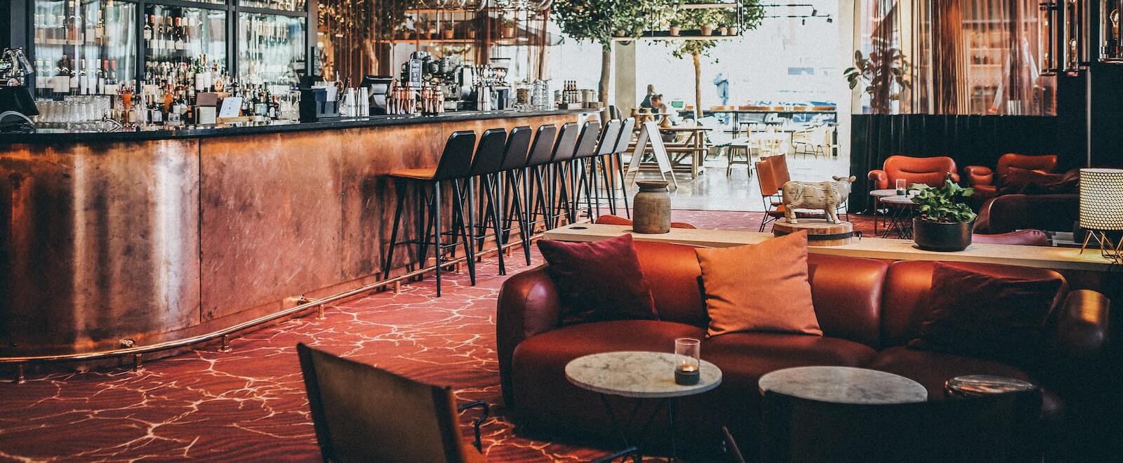
All you have to do is take one look around most modern bars and restaurants…
There might be a granite floor across the dining area, broken up by plush carpet in lounge/bar areas. There could be a tiled backsplash across the back of the bar, marble across the bar top, and metal bar stools with suede seat pads, all contrasting against leather sofas, velvet lounge chairs and wooden decor accents throughout the space to tie it all together.
Are texture and pattern different?
Yes, texture and pattern are two different things in the world of interior design.
Pattern can be created by using contrasting textures but they are mutually exclusive. Pattern refers more to motifs and visual designs (e.g. on wallpapers or fabrics), while texture is more about the feel and physical quality of something. However, both can also be appreciated by eye.
Texture: the great office fit out communicator
Bringing it back to office design…
An ergonomic chair upholstered in a luxurious leather fabric tells you that the space is probably either an executive boardroom or a private office.
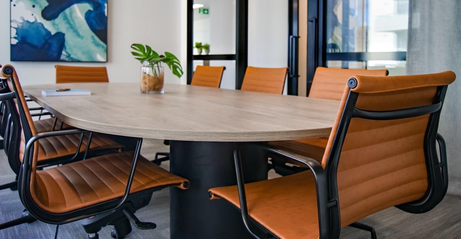
On the other hand, stackable plastic chairs tell you that the space is more multi-functional and is likely used for meetings, presentations or brainstorming sessions.
Rough, natural textures like brick and concrete, and certain materials like linen, cotton and bamboo make a space feel biophilic and close to nature. Smooth vinyl flooring, glass surfaces and plastic furniture, in contrast, communicate a much more contemporary, urban environment.
The vital role texture plays in office design
As we mentioned earlier, texture and the tactile elements of an interior design scheme can be easily overlooked, despite being incorporated naturally or subconsciously.

Here though, we want to get you thinking about texture in a more strategic way by highlighting the functions and benefits texture can bring to the table (…or the floor, walls, and furniture!)
So, what role does texture play when designing a space?
Giving the office more depth and dimension
A space based on a uniform texture can feel extremely flat and won’t be stimulating or engaging to those using it.
Using texture as a strategic part of the design process means you can create an environment that is visually appealing, welcoming and inspiring to those you’re looking to attract, whether that’s employees, restaurant guests, extra care residents, or students.
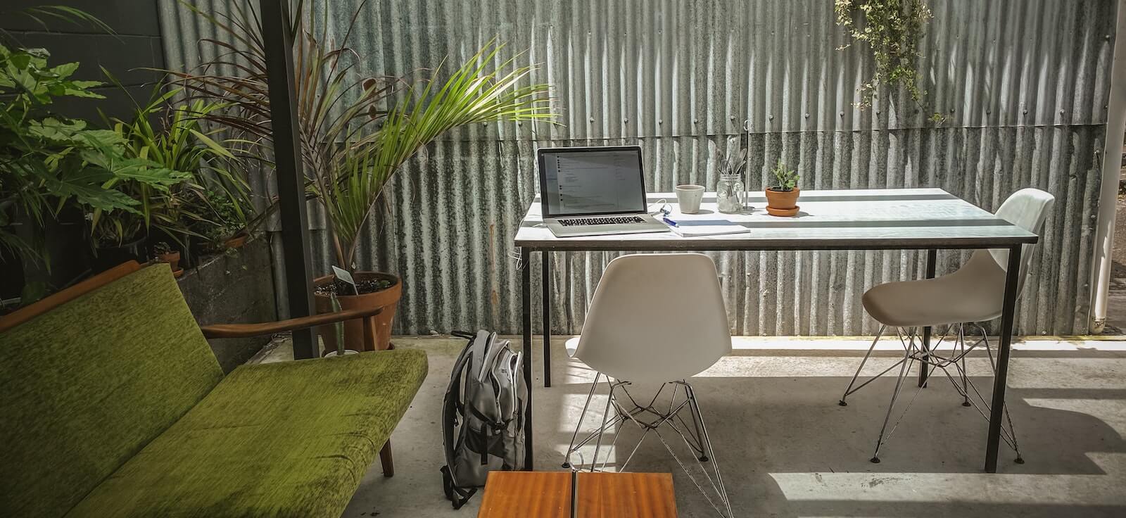
In the instance of workspace design, creating a tactile and stimulating environment is a great way to encourage people to be more creative and collaborative.
Controlling office acoustics
Whilst smooth, flat surfaces might be called for in areas of the space you’re looking to transform, they certainly won’t do much in the way of keeping excess noise at bay.
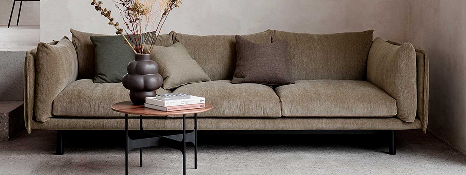
Create an additional layer of acoustic control in a space with hard surfaces, hard flooring and exposed walls with soft textures like plush rugs, cushions, soft seating and big, squishy sofas.
Elevating office design in a more subtle way
For some brands, businesses or industries, playing around with experimental colours and patterns just won’t be a suitable option. Creating diversity through the design using texture though is a great way to give the space personality in a more subtle and understated way.
Zoning and highlighting different spaces
Different textures can also be used – both in contrast and in conjunction – to communicate what a space should be used for and to demonstrate various zones and way-finding around a space.
For example, you might use a plush, high pile carpet in a hotel lobby but parallel this with high-shine granite tiles around the reception desk and pathways which get significantly more footfall traffic.

Influencing the look & feel of a space
Texture within a space is also a highly effective way to influence the illusion of scale; by being clever with texture, you can make a small space seem much bigger (or vice versa).
This is a good tactic to have in your back pocket if you are planning on downsizing your workspace in the post-pandemic era.
Tips on using texture for office refurbishment
Before you go, our experts wanted to share some pearls of wisdom on finessing your use of texture:
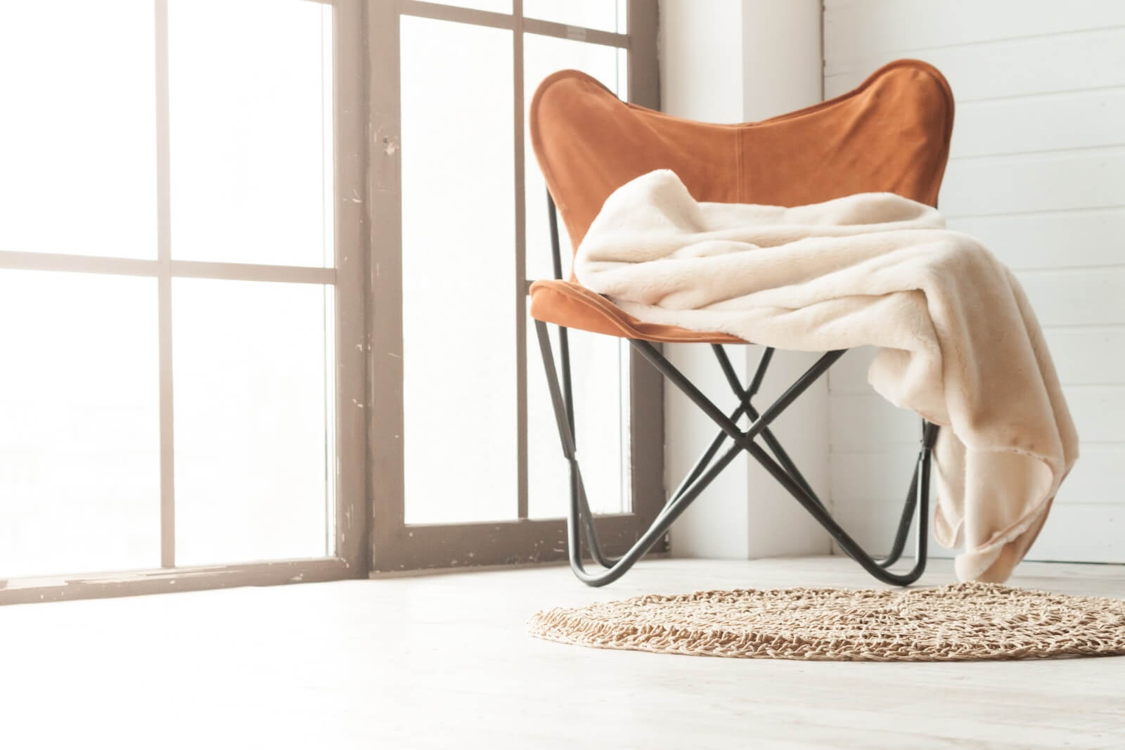
- Don’t be afraid to layer textures to create additional depth and dimension.
- That said, we recommend sticking to 3-4 textures within any one space to avoid the design becoming cluttered.
- Don’t forget textures can look different in different lights so be sure to test all design ideas in a variety of lights to ensure you’ll be happy with the appearance either way. (This is particularly important for cafes and restaurants open during the day and evening!)
