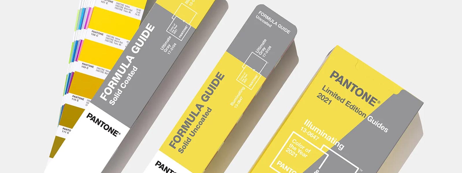
Perhaps it might have been more fitting to title this blog post ‘Pantone’s Colors of the Year’ because for the first time in four years, the international colour communication company has revealed a duo of shades in its illustrious annual announcement. In 2016 it was Rose Quartz (13-1520) and Serenity (15-3919); for 2021 it’s Ultimate Gray (17-5104) and Illuminating (13-0647).
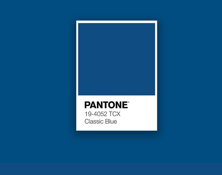
Pantone Color of the Year 2020 was Classic Blue (19-4052) – heralded for its ability to instill calm, connection and confidence. In fact, it’s almost like the colour experts were aware of the turbulence and disconnection that was around the corner for the world following the turn of the decade…
For 2021, Pantone has selected two contrasting hues – each of which sit at the opposite ends of the spectrum in a multitude of ways – and in this blog post we explore the rationale, as well as offering our own advice on how to incorporate the colours into your next office design.
Let’s talk about Ultimate Gray and Illuminating
As with all colours added to the Pantone hall of fame, 2021’s choices have been inspired by a spectrum of different influences from media, arts and entertainment through to travel, fashion, technology and even socio-economic steer. Given the current climate, navigating the ongoing COVID-19 crisis, it’s fair to say that highlighting Ultimate Gray and Illuminating was significantly influenced by culture – or at least in aspiration for a better future for global culture.
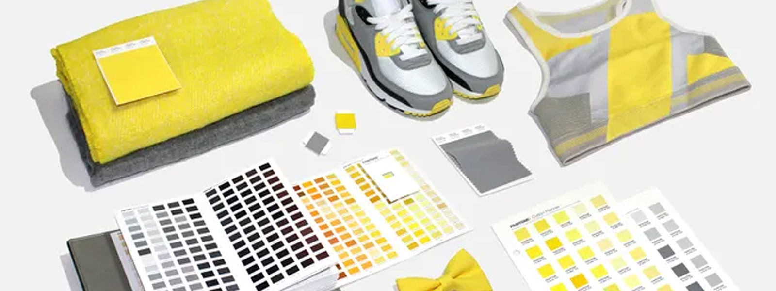
Ultimate Gray (17-5104) – A cool, core grey inviting “composure, steadiness and resilience”.
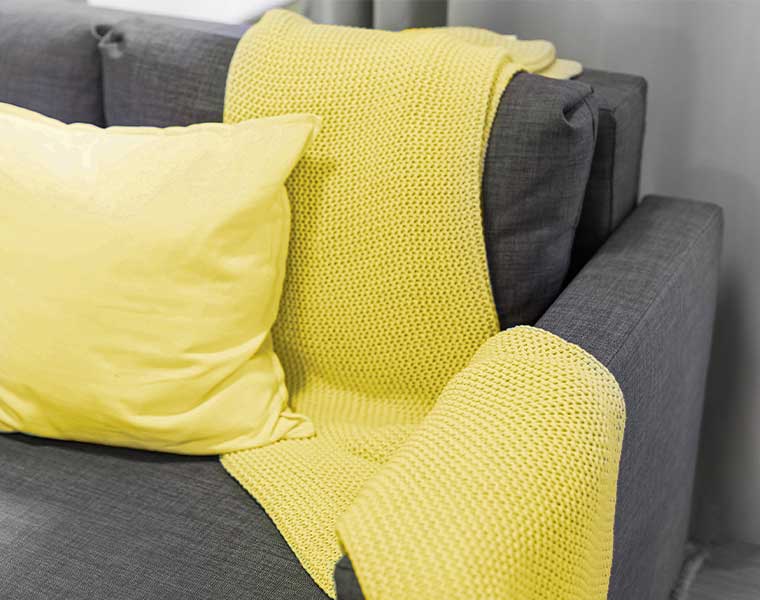
Illuminating (13-0647) – A bright, bold yellow exuding the “optimistic promise of a sun-filled day”.
Together, the two work in harmony to fortify with “energy, clarity and hope”, signifying a combination of positivity and happiness with the security of solidity and resilience. This is despite representing complete opposites: light & dark, day & night, loud & quiet, summer & winter, sun & moon, sky & land.
Leatrice Eiseman, Exec. Director of the Pantone Color Institute said:
“The selection of two independent colours highlight how different elements come together to express a message of strength and hopefulness that is both enduring and uplifting.”
She added:
“Practical and rock-solid but at the same time warming and optimistic, this is a colour combination that gives us resilience and hope. We need to feel encouraged and uplifted, this is essential to the human spirit.”
Using Pantone Ultimate Gray and Illuminating in your workspace design scheme
In it’s own press release around the partnership of Ultimate Gray and Illuminating, Pantone advises that as a “marriage of strength and optimism”, the colours don’t have to be used in equal measure and that either shade can take the forefront depending on preference or requirement. This might be in packaging, product design or fashion but what we’re concerned with here is commercial interior design and furniture.
We’ve not seen anything quite as vibrant as Illuminating yet – not even 2009’s mustard-like Mimosa (14-0848), nor have we witnessed anything quite as neutral and earthy as Ultimate Gray, except perhaps the Sand Dollar (13-1106) muted taupe of 2006. That doesn’t mean, however, that you should shy away from incorporating them into your design schemes – individually or in colour conjunction.
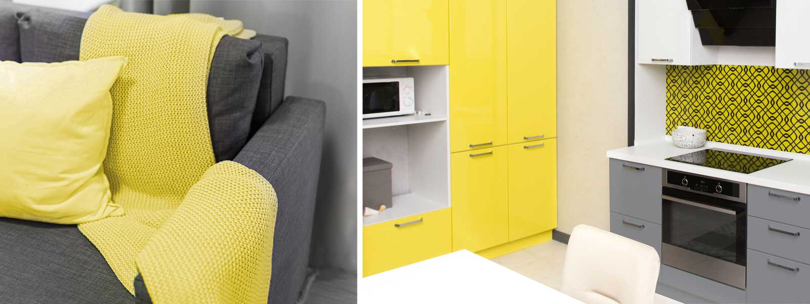
As we suggested in last year’s profiling of Classic Blue, filtering Pantone’s trend-led shades into your workspace aesthetic should by applied with a subtle approach. Trends shift and let’s face it, it will be 2022 before we know it, bringing with it a brand new Color of the Year.
So with that said, here are some ways in which we would recommend experimenting with Ultimate Gray and Illuminating into the colour palette of your space:
- A feature wall
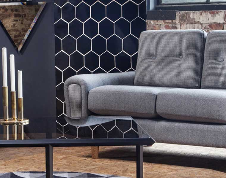
- Accents among your hard or soft furnishings (sofas, arm chairs, task chairs, seat pads)
- Cushions, throws and rugs
- Other decor items like vases, frames, prints, artwork, planters etc
